JF Ptak Science Books LLC Post 1004
Hail, horrors! hail
Infernal world! and thou profoundest hell,
Receive thy new possessor, one who brings
A mind not to be chang'd by place or tie.--Milton


JF Ptak Science Books LLC Post 1004
Hail, horrors! hail
Infernal world! and thou profoundest hell,
Receive thy new possessor, one who brings
A mind not to be chang'd by place or tie.--Milton
|

JF Ptak Science Books LLC Post 1001
This odd, semi-naïve “outsider-esque” map is found in George Wernher’s (d. 1567) De admirandis Hungariae aquis hypomnemation depicts an intermittent lake region of the Inner Carniola region of Slovenia—more precisely it shows the “disappearing” lake of Cirnitz, which is near the town of Otokh. The map (which is oriented west/east

at top/bottom) I think is showing the lake when it is “disappeared”. What happens evidently is that when the water table rises it causes the groundwater and underground streams to also rise, seeping through the limestone lake bed and rising through caverns and sink holes; it becomes a periodic lake, though the appearance and disappearance of the water has been the subject of wide mytho-specuilation for the folks who have lived in the region for the last few thousands years.

These are the only two human figures in the
map, and one of them is holding a rake.
Probably the person, along with the horse-and-rider and the small lake-bed
bridge across one of the rivers were included to hammer home the point that the
lake was gone, and that someone might be farming it.
in the case of the first photograph of a human
being. Well, actually, it is the first photograph that just happens to capture
a human in the emulsion. Since the exposure time was so terribly long for
this image to be made, the moving people and horses and carriages on the
street, all of the city-life bits, were necessarily spectral, and mostly invisible, in the photograph. Only the
stationary
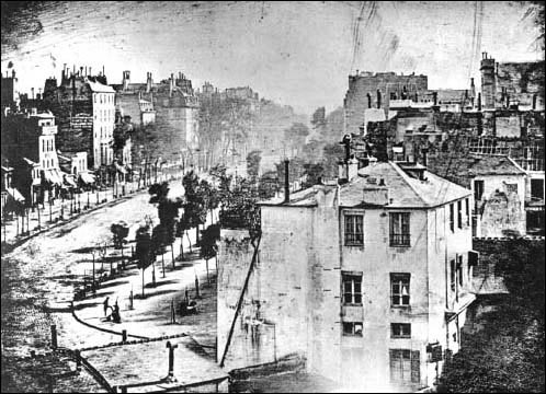 items were captured, and the only people captured here were two
figures in the foreground, doing something or other (shoe shine?) that made
them still for at least five minutes--long enough for their anonymous but
famous photonic impressions to be captured.
items were captured, and the only people captured here were two
figures in the foreground, doing something or other (shoe shine?) that made
them still for at least five minutes--long enough for their anonymous but
famous photonic impressions to be captured. 
|
JF Ptak Science Books LLC Post 994
[This post part of a long and continuing series on Blank, Missing and Empty Things, #54]
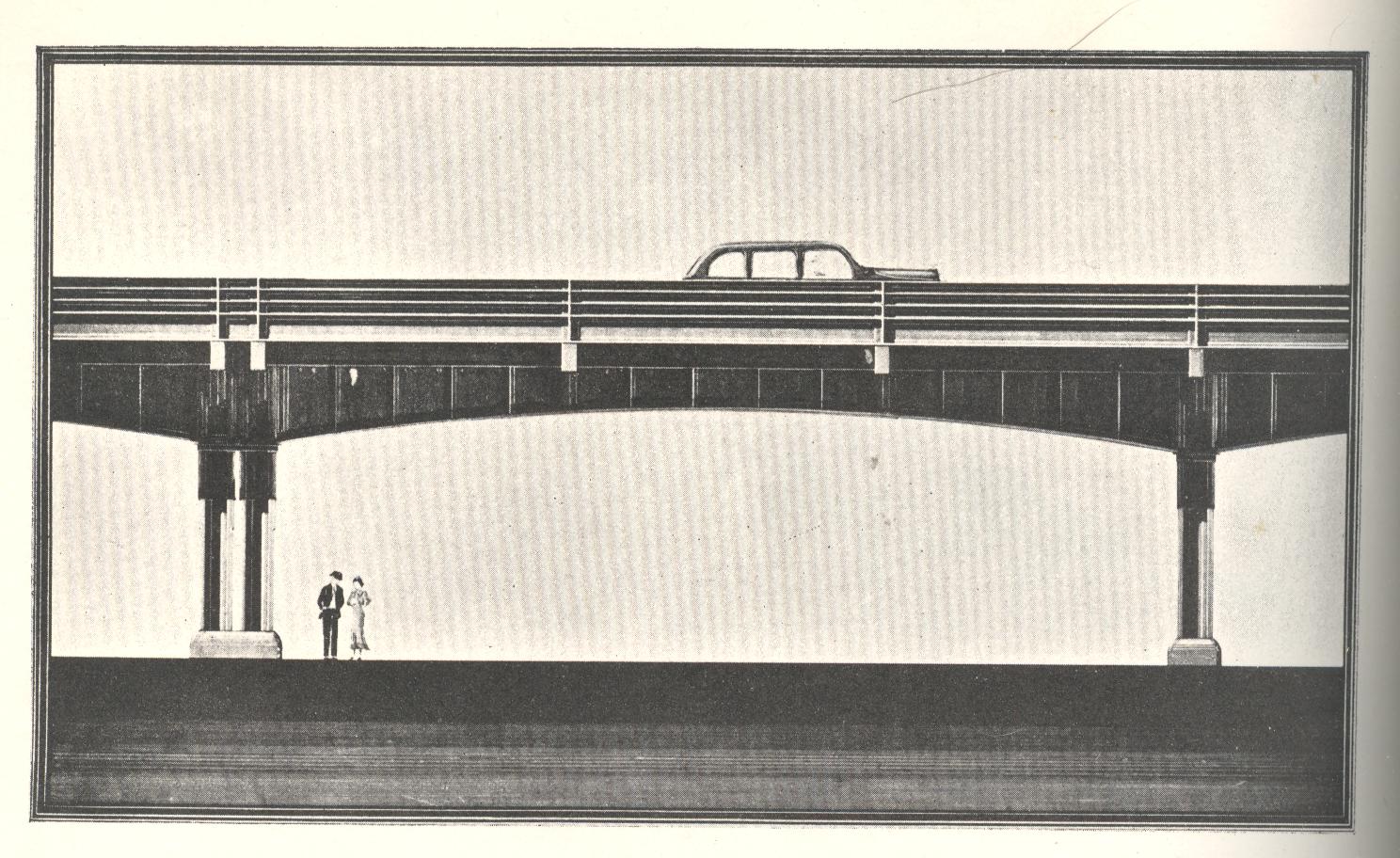
If Edward Hopper was a practicing member of the American Institute of Steel Construction and was a civil engineer, he may have rendered his creations much in the same curious way as those seen below. I found these designs in an obscure publication, Prize Designs Submitted in the Elevated Highway Competition for 1938, and I found them to be utterly fantastic, lost bits of artistic expression and strong emotion sucked into a vortex of automotive steel and concrete. They are just superb examples of found art that seems to play utterly against the purpose of the object, and do seem masterpieces in an unusual (and instantly-created) genre of "Unintentionally Cross-Expressive Art". They have a feel of Outsidery-Edwardy-Hoppery to them--they feel cold, a wet chill, with a coppery audio quality to them...images that make you want to go home and sit in a comfortable chair.

And not only are they lonesome; they are also foreboding:
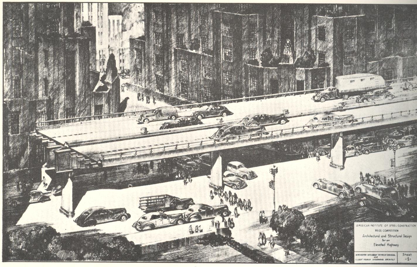
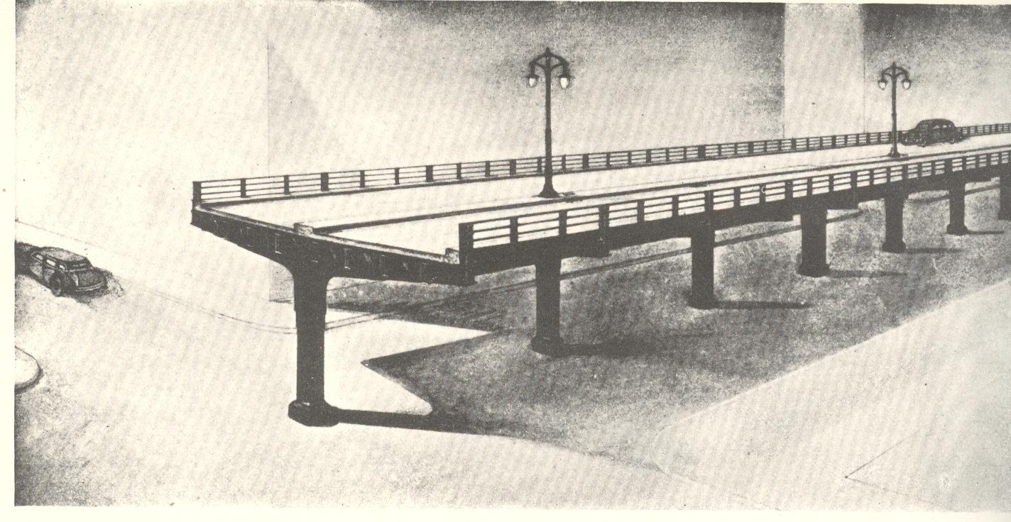
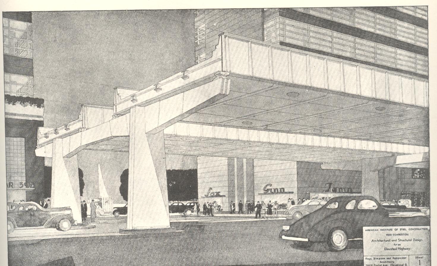
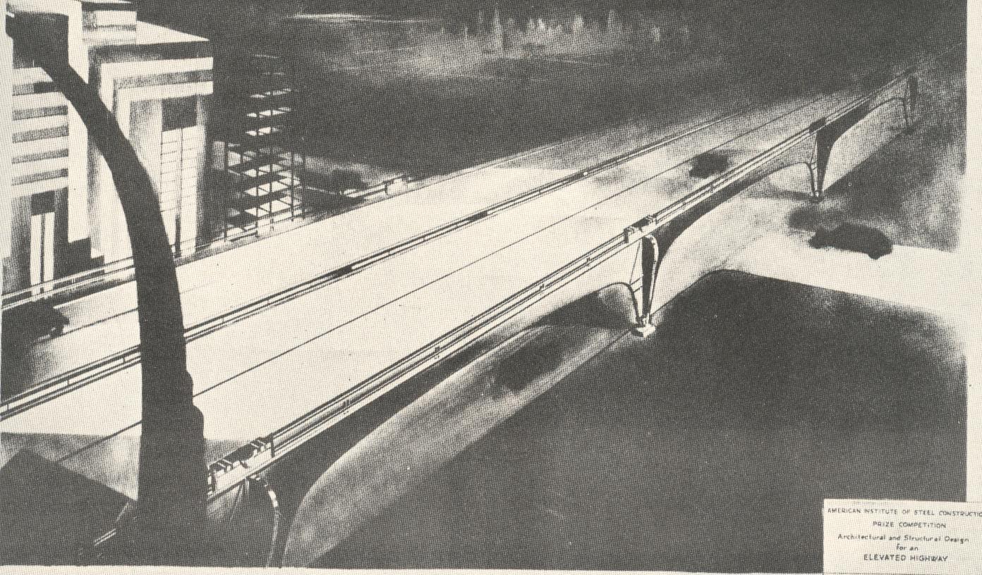
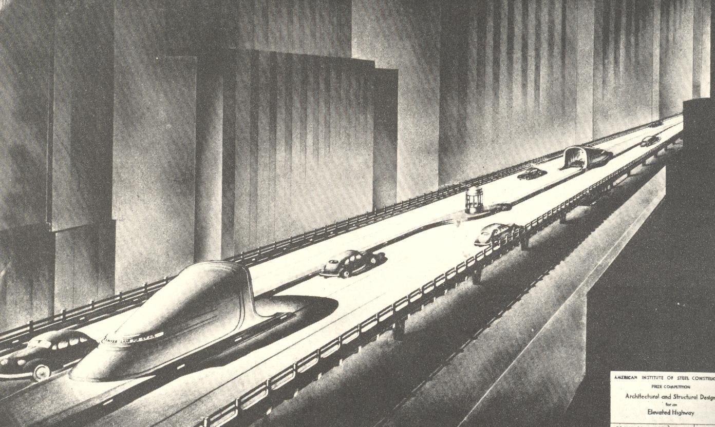
Magnificent! And all once hidden away, but no longer.
|
[see also my related posts on Women Meat Pioneers and of course Meat String and Curled Hair]
I have a suspicion that the author of Eat
Meat for a Successful Life, G.H. Brinkler
(a “N.D.”, doctor of nauturopathy, from the

Most humans don’t do so well without water after a few days, though there are extreme cases where people have survived for several weeks without water. To have survived 1,820 weeks seems pretty much to be well on its way to being a vastly under-appreciated record of human endurance.

But the main story here of course is the meat, with the waterless bit woven through it like heart-ending marbling in a butt chop. Meat, as we are told by Mr. Brinkler, is pretty much a “natural fixer” for just about anything. Lazy in the morning? A pound of pork on the broiler will cure that. Sexual inadequacy? Solved with meat (ingestion). Poor memory?--the answer: meat, and lots of it. And not only just meat; it definitely needs to be not lean. Big fatty meats are the greatest source of the desired “muscle food”; lean meats, unfortunately, are only “nerve foods”. Somehow the meat mixed with the waterless way induces the “nerve-ends” into a “more natural” and strengthened existence.
The Brinkler follower should also chew their meat less. “The masticating fad might result in tiring the jaws and gross undernourishment”.
I could go on and pull further quotes out of context from this piece, but that would be mean. The pamphlet (1934) I have is the U.S. Copyright Deposit copy, and I suspect that there may not have been many copies other than mine. I think that all the man was trying to do was sell broilers.
|
JF Ptak Science Books LLC Post 988
In the history of archaic thought it doesn’t take very much at all to reach the uncomfortable bits in the sulfurously tangled history of the subjugation of women. But it is most interesting when you find the points at which the “backward-looking” archaic parts are actually somewhat forward-looking for their time.

Such is the case with this odd and interesting little pamphlet, Women in Men’s Clothing, published by
the Vultee Aircraft Corporation, and published in 1943—it can be simultaneously
awkward as a broken product of its time and oddly, slightly, futuristic (with a grudging and clawing recognition of women as possible equals as members of the work force). Overall the publication looks pretty painful from today's perch, but when you look a little past the winces you can see a little bit of recognition for women in general; at least this is far forward from anything that might've been published slightly before the war.
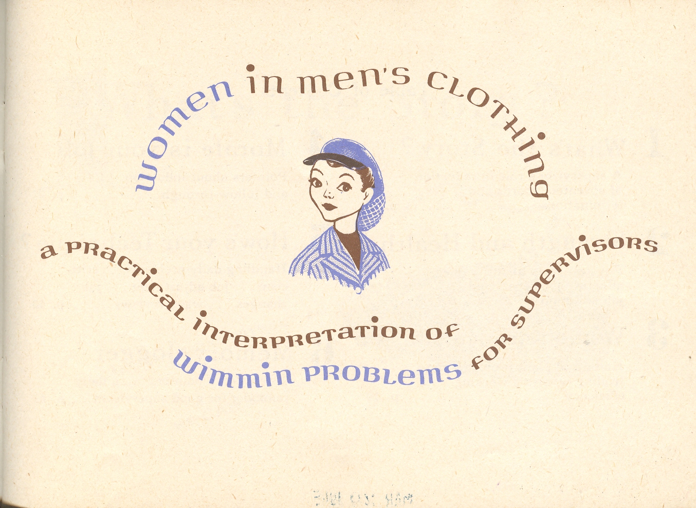
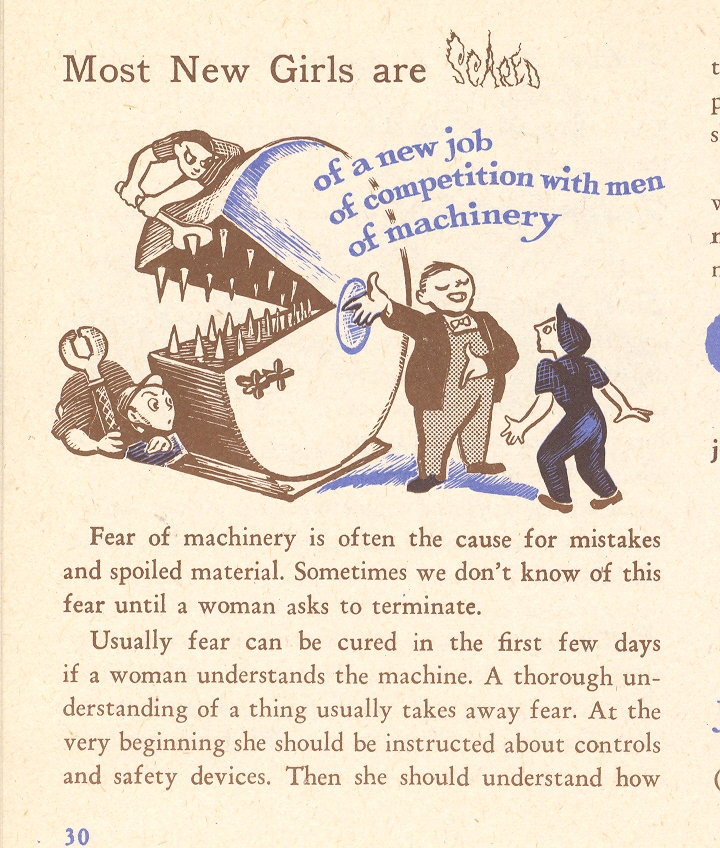
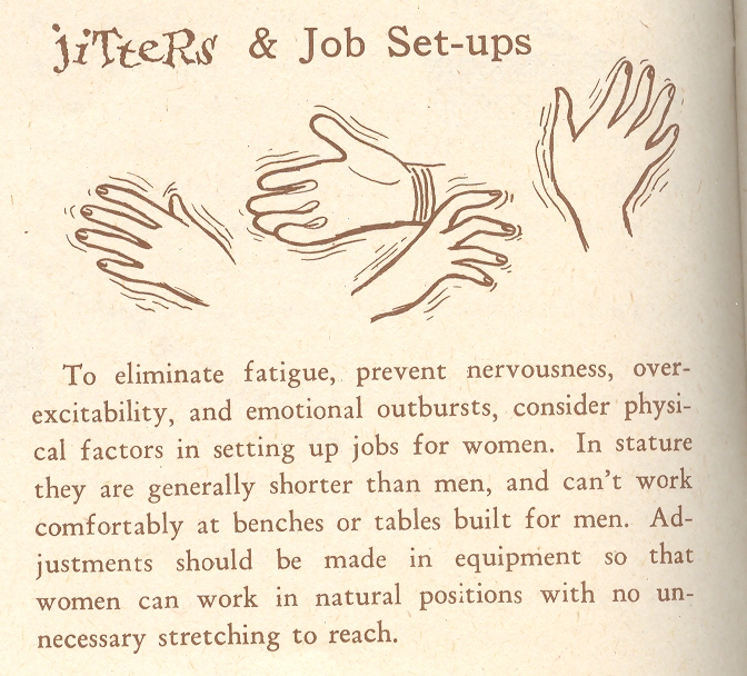
The pamphlet was intended as a human resources tool for managers and supervisors in an aircraft production facility where women had been sought and recruited to fill the very many vacancies brought on by the war. (Millions of women entered the workforce for the first time between 1942-1945; millions of them exited too once the servicemen returned from active duty to reclaim their jobs.) For most industrial supervisors, the prospect of women in the workforce was not a welcomed one, and many had never before needed to think of such a diversified workplace. This slight publication translated the idea of “women/"wimmin” for these men.

The "translation" of the understanding of women from home to the workforce doesn't go very far to advancing the understanding of women at work--they're pretty much the same (dogmatic, condescending, sexist, domineering).

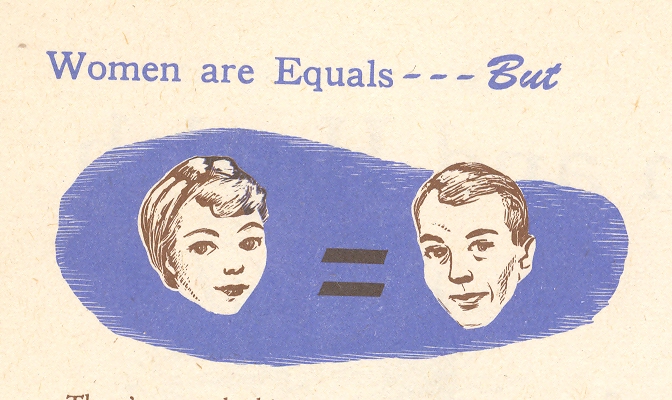
All of that is pretty well summed up by the first picture in this series--the asterisked "equality" between men and women. I must admit that I don't think I've ever seen this "equals, but" label before, or at least so deep into the century.
And of course "women are Human, too" needs very little comment...as is the case for most of the images in the pamphlet.

|
JF Ptak Science Books LLC Post 980
Nothing
quite makes a profound statement like simplicity—the same sentiment applies
to the incredible, or impossible, or
inconceivable statement as well. For
example, Gertrude Gates Mudge’s “An Interesting Experiment with Malnourished
Children” (The Nation’s Health, August 15, 1922) seems quite an
exclamation without an ounce of emphasis in sight, a vast oversight of decency
compounded in its inelegant simplicity. Evidently acceptable (at some level) in
its own time, the announcement today seems criminal.

The
world is full of such pronouncements—perhaps they’re the very bones on which we
all walk. I was drawn to this subject
this morning, finding a bit of undoubtedly long-lost historical reporting on
medical experimentation which (in its second paragraph) makes the following
overwhelming understatement: “an institution is a perfect ‘human laboratory’
for experimentation”. It comes from a
small pamphlet published in 1924 by the Borden Company called The Catonsville Experiment It seems that Borden (a famous and large
dairy company) was trying to experiment with children to determine the
effectiveness of their new sweetened condensed milk over “regular” milk. They attempted experimentation in public
schools, but could only statistically control for milk intake at the school
itself, finding it “impossible to have
complete control over the rest of the childrens (sic) diets”. In the free school situation the Borden
company could also not control for exercise, sleep and “health concerns”.

That is when the idea struck the Borden Nutrition Department to conduct their study in an orphanage. Borden’s aim was to test the healthy effectiveness of their sweetened condensed milk, and to also show that “no abnormalities in physical growth, bone development, blood count, and kidney function would result from such an experiment”. What this means is that there events were a possibility, but it was worth it to Borden to test their hypothesis out on actual human children.
There were 60 children in the “experiment”, divided into two groups, one of which was the control. All facts of the lives of the children were controlled from March 15, 1924 though November 30, 1924—play, regulated sunshine, sleep, schooling, rest, and of course food intake. Medical tests were conducted (frequencies not specified), including general overall medical evaluations as well as blood and urine tests—there were (at least) 18 sets of x-rays over 270 days. Psychological and intellectual tests were also conducted, with the children measured over dozens of different categories, including 14 classroom activities.
The
Borden Company published the results of all of these experiments in this small
pamphlet, with one large (and impressive) folding diagram outlining some of the
medical results (shown below).

There were also two photographs of the test subjects. Undoubtedly they were not intended to look as though they were trophies, but that is the general feeling I get when looking at the photographs.
The bottom line was that Borden found their own product to be safe, and to not cause kidney, liver or bone damage. Which was good news to the children who were their test subjects.
Remarkably Borden published these results two months after the test ended, evidently without any assumption whatsoever that if there were to be negative effects that they would occur immediately, and that a longitudinal study was wholly unnecessary. Once the experiment ended, so too did the nee for testing their short-term hypothesis of damage to the children.

I wonder about what the effects of the 18 rounds of x-rays in 270 days were on these children, over time.

No doubt that in the dark history of human experimentation the Borden exploit would find itself in somewhat mild company--this of course hardly relieves them of their gross injustice of subjecting children to this sort of control and possible danger just so that the company could sell a milk product. It is an action that makes me think more of Lizzie ("I gave my mother forty whacks...") when I think of Borden than Elsie the Cow. After a long run of financial successes, including being one of the leading dairy companies in America (and the owner/producer of Elmer's and Krazy Glue, among many other diversified things), the Borden Company was completely and totally divested in 2005.

|
JF Ptak Science Books LLC
Sometimes the beginnings and ends of things show up in unexpected places. Penzias and Wilson at Bell Labs in Holmdel, New Jersey, discovered that the reason for the "interference" readings that they were receiving in their instrument was not due to pigeon poop, but was actually the remnant radiation of the Big Bang. And it didn't look like much, but the stuff that caused the end of the great American Western frontier was found in simple lines: ribbons of steel for the railroads, on the one hand; and twisted bits of sharp metal wrapped around wire, the barbed wire fence ultimately and very cheaply closing off the vast land into manageable parcels, on the other. Stories like these are legion.
It is infrequent to find the two combined though in a simple, single photograph. This is the case, for me, in this small (1-inch tall) image found in an obscure publication called The Kentucky Mountain Echo, a True story of the Mountains, published in 1929. The small, delicate pamphlet seemed the physical opposite of the stories that it told, rocky and rough bits of life from the Kentucky mountains, hardscrabble farms, luscious woods and company coal mining towns.
The Rev. Bud Eversole is pictured here--along with his dog--at the spot in his farm in which he was taken by the guiding light, the holy spirit; an invincible vision took hold of him and never let go. Rev. Eversole continued to work his farm and taught the scriptures for free for many years afterwords as a roving minister. He marked the spot of his conversion with a pole; he also determined that the pole would mark his grave, the ultimate place of rest for him at the very spot where he was "born".
For all that it symbolizes, the image looks pervasively unsettled to me--Rev. Eversole (I have no idea if that was his real name or if it was a post-conversion creation) looks like he is waiting for something, anything, even for the late afternoon sun to just hurry up and warm his back. This area of his farm just looks a mess, not like a small farm kept between and along rolling hills (no treat, that). The Rev. doesn't tell me much, except that he was obliged to allow his dog in the photo, and took off his broad-brimmed hat to have his picture made. Perhaps that is all that he wanted to say.


|
JF Ptak Science Books LLC Post 944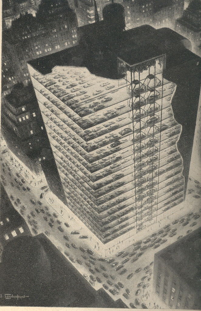
"The Edge... there is no honest way to
explain it because the only people who really know where it is are the ones who
have gone over.
Oddities and Curiosities and the Tryphiodorus Award
Sometimes things that were just done because they could be done aren’t necessarily an accomplishment—they may use letters in the alphabet and make words, but the words really don’t seem to take us anywhere. Literally. There is a literary practice (and I mean this in a medical or forensic sense) in which the writer chooses to not use a particular letter of the alphabet, abandoning it for very private reasons into the dustbin of abandoned alphabet letters. (That dustbin is generally empty until one of these people show up with the idea of filling it, unless of course we expand the dustbin to include punctuation, and then it gets filled rat her quickly (though not in the Steinian sense).)
The work which most filled the alphabet dustbin more than any in history is probably the Odyssey of Tryphiodorus (a Greek grammarian who flourished in Egypt ca. 4th century ACE) effort written in 26 parts, each segment abandoning one letter of the alphabet until each letter had been completely omitted from one section.. The author could have a lot of time by writing this 26-part cycle in all at once, in one part, abandoning all 26 letters at the same time—this may have produced a more elegant result (with the Bellman’s map coming to mind).
 This
Odyssey may have produced a sort of a
lipogramic palindrome, in a squinty-eyed
way.
This
Odyssey may have produced a sort of a
lipogramic palindrome, in a squinty-eyed
way.
Which
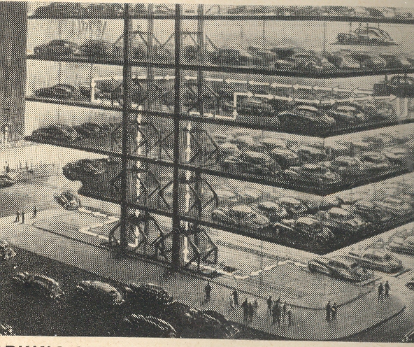
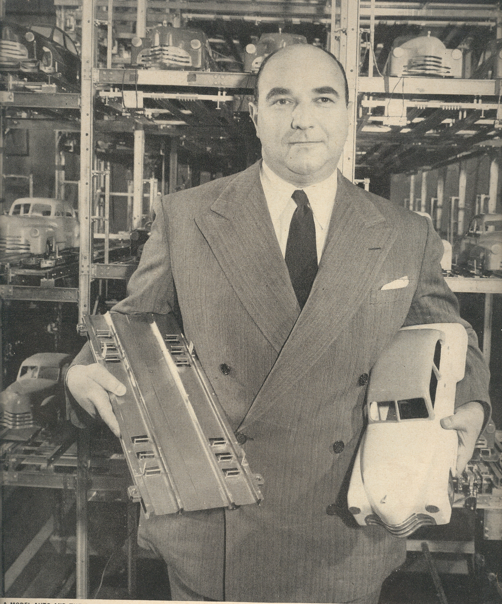
brings me to this odd structure proposed by real estate mogul and hyper-builder William Zeckendorf, whose vision brought to
the pages of LIFE magazine in 1942 (?) a
very tall completely automated structure designed for nothing but car
parking. People would drive to NYC in their own cars (!) and park them in this
car hotel; the car functions would be given over completely to the building, moved
into their spots and juggled and finessed into position by conveyors and forklifts
and such. 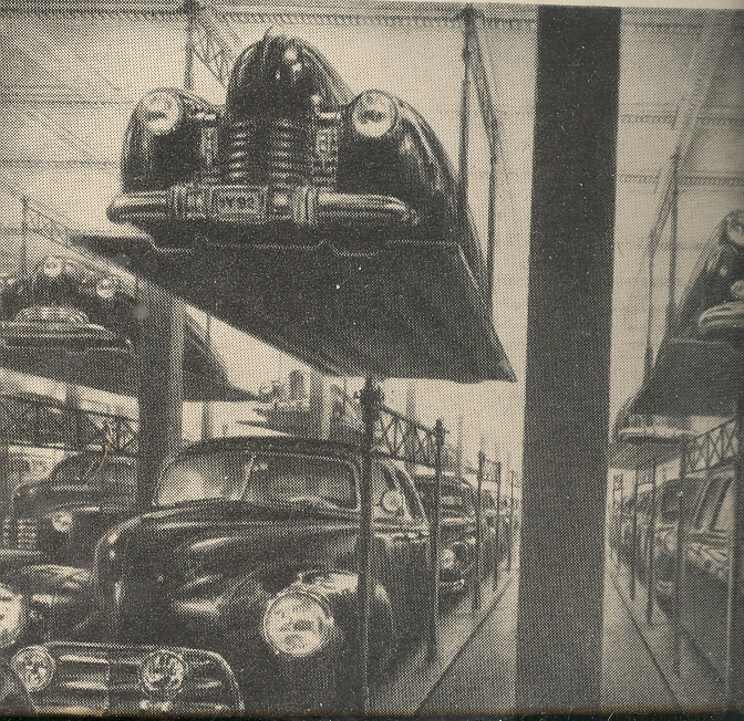
Cars in a building, moved about free of humans, rested; humans on the street making their own human traffic. The whole idea, the entire structure, seems backwards to me, the meaning of a building turned inside out, wanting the essential idea, forwards and backwards being simply a bad notion.
The picture of Mr. Zeckendorf—who was tremendously energetic and who had very many good ideas along with these heavily popularized odd plans—standing in front of a lovely (scale?) model of his parking structure makes me want to see another, smaller version of Mr. Zeckendorf and his model standing just behind it, and smaller one after that, and so on…a fractally bad idea deserving of the Tryphiodorus award for missing the most sense. I bow deeply to Mr. Zeckendorf for trying and for constructing this beautiful (I want it) model.
|
JF Ptak Science Books LLC Post 940
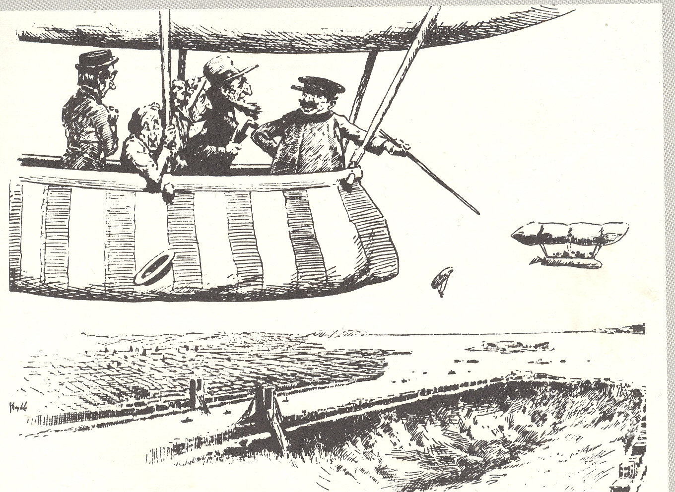
NYC has certainly had its imaginary/creative trials and tribulations over the last 400 years or so, but I must say that these two depictions of the state of the city are the most, well, unexpected as any I've ever seen. The first comes from 1902 and is a forward-looking appraisal of the chances of New York City in the near-future. The aeronaut tourists are being told by the aviator/carny--floating above Manhattan in the future, in the year 1920--that those chances are not very good, the city having disappeared under its own weight, sunk by the growing skyscraper1 population in a ground loosened by too-numerous tunnels. The cartoon is a joking editorial, of course, a riposte to the relatively new building jag that pushed big buildings to great new heights. [A post on more realistic views of the City of New York can be seen here]
The second image on the other hand is not a farce; it is one of the strangest (published) unintentionally Outsider, unintentionally Absurdist/Dada works that I've ever seen. It appeared in a post at the very start of this blog (two years and 500,000 words ago) and it remains a capstone of Mondo Bizarro category2.


This 1941 pamphlet isn’t so much “interesting” as it is interestingly illustrated, where all of the semi-coherent interest resides, the text having left coherence far behind, somewhere, in it own intergalactic dust.
This is the only known example of the depiction of an extra-terrestrial New York City pictured with the earth in the background.
Huh? Yes, this is the Big Apple in space—not its own space but THE space, outer space—somehow, impossibly, removed to some something-or-other (actually in this case, a “bubble”) that, while not being the Moon, was something like it, though not actually a solid and without gravity, floating on a base of floating effluvia and hope, but, well, you get the picture. Whatever we’re floating on here (actually it is identified as the “perisohere” (don’t ask)) is very big and very very close to the home planet.
The author, David Gordon, is certainly after something, but what that "something" is I just don't know. He starts things out for the reader asking a series of questions like “why does the earth and other heavenly bodies remain in the air and submerged”, answering them with other questions.
In all of this Mr. Gordon produced a work of staggering incredibility, more so since it wasn't an intentional science fiction effort, and in my book any time anyone reveals such a shocking piece of thought deserves a special kind of praise. I'm just thankful that the pamphlet was illustrated.
Notes:
1. The word "skyscraper" appeared in print only nine years before this cartoon (Harper's Weekly, April 1893), thugh the necessary elements like heating and cooling capacities, electrical lighting, plumbing [with appropriate, siphon jet toilets], elevators with dependable brakes, had been in place since the 1880's or earlier.
2.. One of the other capstone publications written about here is the monumentally bizarre work on sculpting in fat and lard:

|
JF Ptak Science Books LLC Post 938
Harold,
like the rest of us, had many impressions which saved him the trouble of
distinct ideas George Eliot.
A novel is balanced between a few true impressions and
the multitude of false ones that make up most of what we call life.
Saul Bellow
No, this isn’t a story about the great saint but a much lesser one. For centuries the pulse was a vaguely understood thing reaching back into the murky medical past as far back as Galen. The association of course was with the heart, and the association of the heart was as the great controlling center of all function and control of the human body—a theory that reached far forward into the 16th century.

Servetus (physician, cartographer, theologian, writer and
general all-adept Humanist of a high order) was in trouble with the church for
many reasons, not the least of which was trying to dislodge the theory of the
heart as sacred and the seat of wisdom.
But he did establish that the heart was an organ, which didn’t sit well
with very many people, least of all the Calvinist court in
Later on,
|
JF Ptak Science Books Post 937
In the midst of a massive building campaign by Germany and a building-response by England the French journal L’Illustration published these two side-by-side pictorial comparisons of their two navies, which wound up being reprinted in the Illustrated London News soon afterwards in June 1912. [Royal Navy, left; German Navy right]
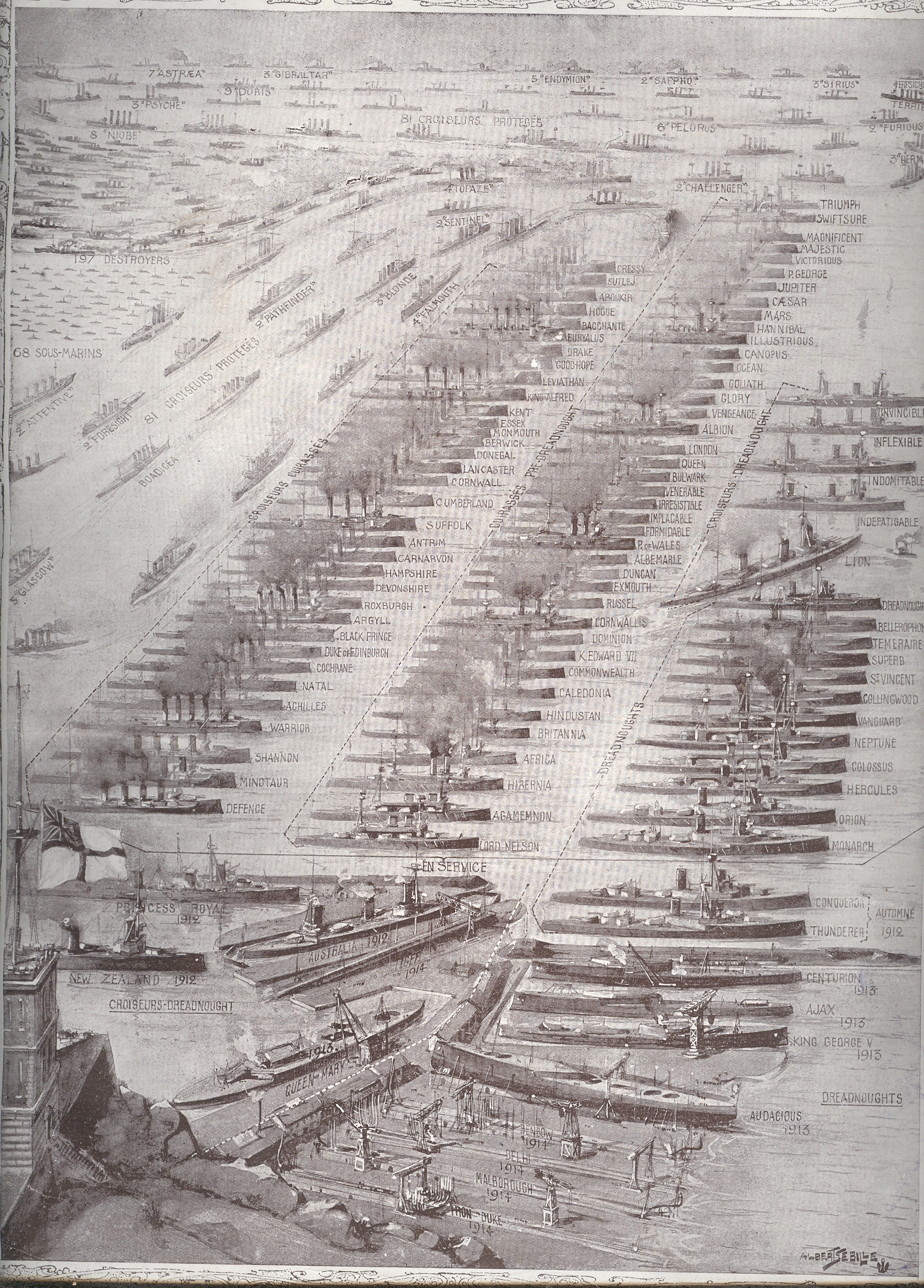
Germany began a rebuilding campaign in 1902 which by 1908/9 was seen by the British Admiralty as a “stab at the heart” of England’s military supremacy, and so the construction wars were undertaken. It’s a complicated period and a complex race, which I just can’t get into in a short post, so let’s just say that the Brits wound up the winners of the competition when these images were printed in June 1912.
The hidden element of some great importance, a trump card that would played in just 750 days, would be the small dot-like drawings labeled “sous marins”. These would be the submarines, and it would be the subs that would be perhaps the most significant aspect of the entire German navy.
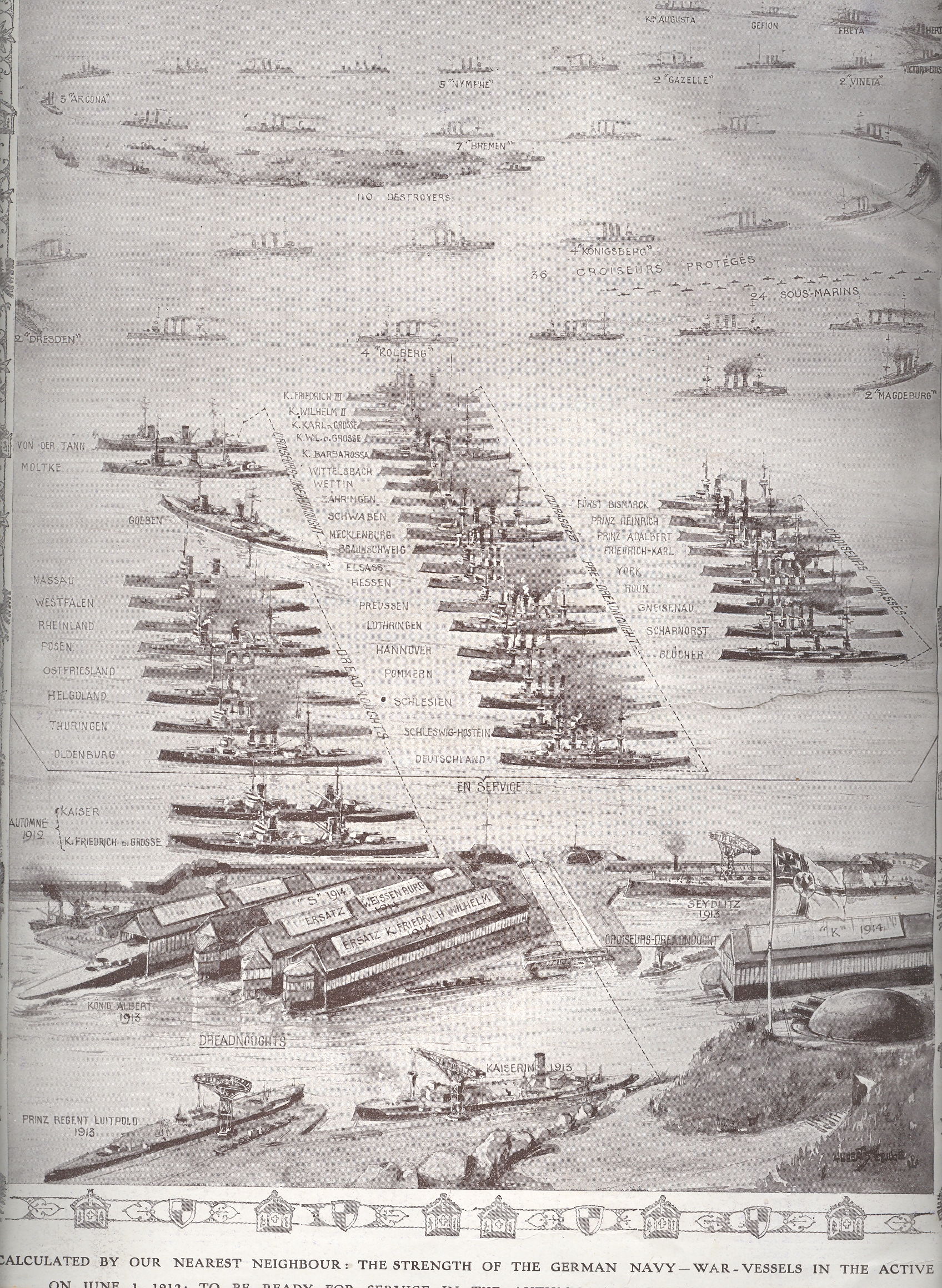
This was true in spite of what looks like an overwhelming preponderance of subs in favor of the Royal; Navy, where the count was 68 to Germany’s 24. It was really a question the type of sub, and as it turns out there were only 8 or 9 of the English count that could’ve been considered for blue water ops.
Germany began the war with 24 submarines in 1914; they recognized the ship’s importance and by war’s end ramped up production, winding up with 351 in total production and with 178 in action in 1918 alone. Of that overall number fully half (178) had been destroyed in combat, with another 11% sunk via other means. There were more than 12 million tons of Allied shipping destroyed by the German sub forces from 1914-1918 (half of that in 1917).
So these two illustrations do portray an overwhelming Royal Navy, but they certainly do not give any hit whatsoever to the coming importance of the German submarine fleet.
|
JF Ptak Science Books LLC Post 936
“Ring around the rosies, a pocket full of posies,
Ashes, ashes, well all fall down.”
This
old nursery rhyme has more to do with plague than a skipping-and-falling song, more
like the Tom Wait’s version of the “Dwarf’s Marching Song” (“Heigh Ho”, see
below) than anything t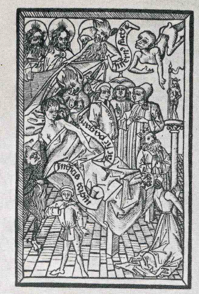 hat could ever be dreampt of in a Disney film. It was the
mater-of-fact way of dealing with the vast death brought on by the various
Plagues: saying a round of rosaries to
try and invoke divine intervention to keep the disease away from the prayer-mender;
posies as a fragrant flower to mask the stench of those actually afflicted with
the disease; and then of course the ashes from the piles of burnt corpses of
Plague victims, fallen down to death.
hat could ever be dreampt of in a Disney film. It was the
mater-of-fact way of dealing with the vast death brought on by the various
Plagues: saying a round of rosaries to
try and invoke divine intervention to keep the disease away from the prayer-mender;
posies as a fragrant flower to mask the stench of those actually afflicted with
the disease; and then of course the ashes from the piles of burnt corpses of
Plague victims, fallen down to death.
These two images show different aspects of segregating—if not hiding—disease. The first is a propagandistic portrayal of a man dying of the Plague. This snippet of plaguaganda was an ars morendi published in the 1460’s, and depicts a not-gruesome portrayal of what was generally a very gruesome death. The inflicted lies there in bed, with sheets and a pillow, looking faint and removed in the retiring Victorian fashion (removed 400 years), surrounded by images of his faith/belief.
I
suspect that anyone who knew anything about the Plague knew that this scene
wouldn’t be truthful, necessarily, but I guess if it could even momentarily confuse
the viewer into thinking that the visitation of Death could be so composed in
the face of this horrendous disease, I guess that’s the hope you hang
onto. There is a minor battle between
the possible claimants of the soul of The Sick, but that would be going on
anyway whether the coming death was relatively peaceful, or not. There wasn’t
much to be done—as the feeble attempts of preventing the disease would
indicate, what with choices like urine baths, bleeding, leeching, bell ringing,
pus-sucking, rotten animal corpse talismans, incense burning being some of the
preventative choices—so like a belief in Heaven or Nirvana or whatever, the hopeful
consolation of a possibly decent dying could keep people from running
amok.
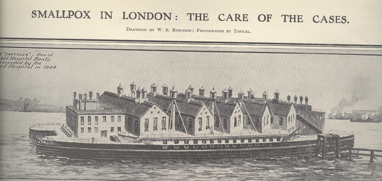
The
second shows the hospital hulk Castalia, “one of the old Hospital Boats superseded
by land hospitals in 1904”, which was more a floating street than a hospital. It was a complex of five buildings nested on the
hulk of the double-hulled paddle steamer Castalia—appropriately named, as it refers
to the Delphian fountain that Apollo fabricated
from the nymph “Castalia” and alludes to the possibility of rejuvenation and
cleanliness, or health, perhaps). The
hospital held hundreds of smallpox patients, sent there by the Metropolitan
Asylum Board in an effort to stem the flow of the disease and infection rates
from the rest of the population of
Notes:
|
JF Ptak Science Books Post 934
This confusing title is accurate without very much grant in license and tells a short and true story of three fitful maps, two of which are beautiful and one just so-so.
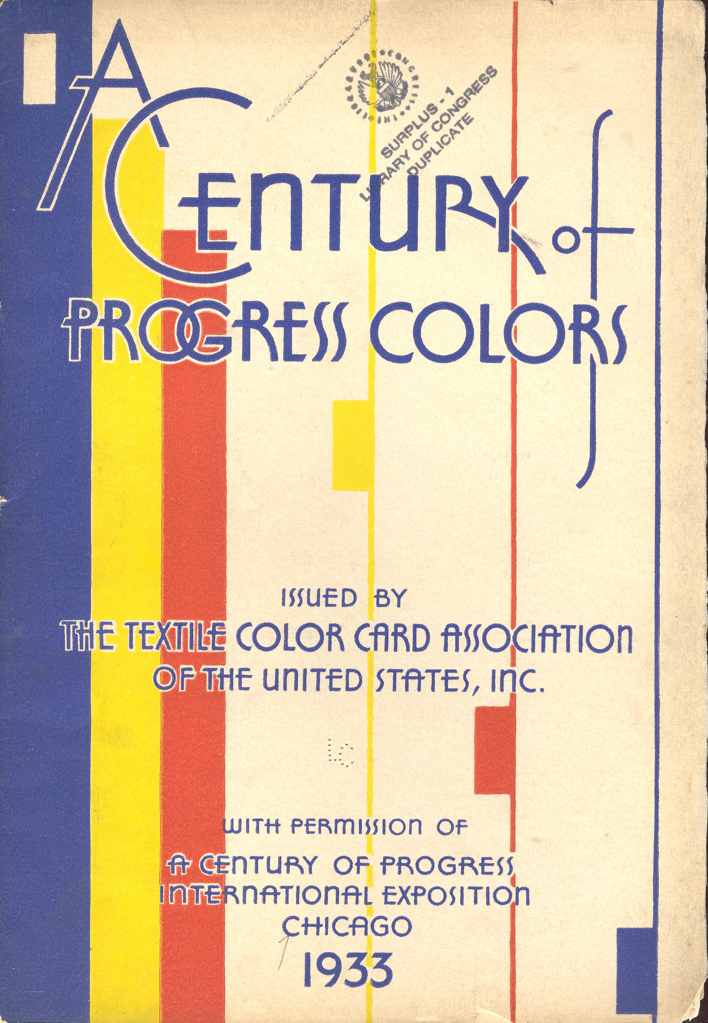
The first map fit is featured in a beautiful pamphlet called A Century of Progress Colors and was issued by the Textile Color Card Association of the USA.(The title being a small play on the 1933 world’s fair in Chicago called “A Century of Progress”. The Textile Color Card Association was created to standardize color nomenclature and composition in industrial colors (and is still in existence.) The map distributed the major pavilions at the fair by their dominating colors, naming those colors in the unusually-sequenced double-page key on the following pages (below1). I can certainly appreciate the effort and the beautiful design it produced, but as a map of the fair it leaves much (if not everything) to be desired.
The second map fit belongs to a small pamphlet published by Albert Coble called Games of Colors, Kindergarten and Primary Exercises. Its actually an enterprising little book about reaching into the minds of little ones and explaining how colors are put together and how they relate to one another. It is unfortunate that the drawings used to illustrate the color map part of the pamphlet were done in black and white. Which is a little on the self-defeating side.
But the finest fit of the three fits is fit number three, which is the map of the Bellman’s tale, starting the second fit of Lewis Carroll’s The Hunting of the Snark, an Agony in Eight Fits.
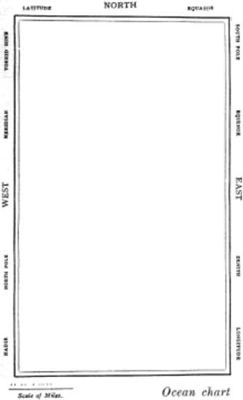
But the map that I think I love the most illustrates Lewis Carroll’s The Hunting of the Snark, an Agony in Eight Fits, and occurs in the Bellman’s tale, starting the second fit1. It is simply magnificent.
Then, of course, there is this:
Notes:
1. The key:
2. The fit begins so:
The Bellman himself they all praised to the skies-
Such a carriage, such ease and such grace!
Such solemnity too! One could see he was wise,
The moment one look in his face!
He had bought a large map representing the sea,
Without the least vestige of land:
And the crew were much pleased when the found it to be
A map they could all understand.
"What's the good of Mercator's North Poles and Equators,
Tropics, Zones, and Meridian Lines?"
So the Bellman would cry: and the crew would reply,
"They are merely conventional signs!
"Other maps are such shapes, with their islands and capes!
But we've got our brave Captain to thank"
(So the crew would protest) "that he's bought us the best-
A perfect and absolute blank!"
|
JF Ptak Science Books LLC Post 631
[A continuation of the blog series "A History of Blank, Empty and Missing Things"]
The sweetest pleasures come from unexpected sources. Mozart--who loved the game of billiards and was an exceptional aficionado1 of the game while playing it with little skill-- enjoyed composing on the table as well, rolling balls in geometric patterns across it while working. To observers it might have seemed as though he was interested in the patterns themselves; it delightfully turns out that what he was really looking at were the changing reflections in the surface of the balls.
Years
ago my wife (Patti Digh) and I visited an artist in his studio at the lovely
high-road-to-Taos town of
I enjoy these quasi-synesthesic experiences a great deal, though they are very hard to “find”. Sometime though they slip into the print world, and I include three examples below.
(1) Putting the Pulp in Fiction, and Fact: the Sharp First Step in Paper-Making
Just about the first step in making paper is collecting and preparing the raw materials from which the paper is made. Linens, cottons, wood and straw (among other things) would be reduced to a pasty pulp through vigorous pounding, tearing, wetting stabbing and rending, all of which would be reduced to a pasty, fibrous pulp which would wind up after a bit spread over a wire mesh until dried and then, through a great non-miracle, becoming paper. This is a process that was little changed in the Western world for many centuries.
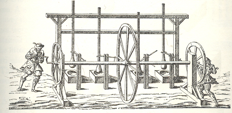
The most lovely of these early pulp-rendering, “stamping” machines, to me is the fabulous two-person human-powered stamper/shredder, published in 1579. (I don’t know the original source for the wood engraving; this image appears in Charles Singer’s monumental History of Technology, from the Renaissance to the Industrial Revolution, vol III.
The men turn crank, crank turns wheels and rod, rod turns arms, arms forced to move vertical poles up and down, stampers on the end of poles pound the rags. Actually the stampers had changeable stamps so that the man-machine could start with a spiked stamper for rendering and then move to a roundish stamp for pounding into decomposition in a wooden bowl with mushy water.
I just really like the machine and its representation, and of course the round stampers and bowls of mush. It all seems so innocent in a creaking antiquarian way—but the great surprise for me is that I can just about hear this machine at work. The all-wooden structure with slowing-turning wheels grinding against its constituent parts, worn smooth from use; the slow pounding of the stampers into the thick paste; the creaking motions of the too-slender superstructure. I can hear it about as clearly as I can hear the soft/high clinking of the bottles in the milkman’s tray.
(2) A Scene of Western Quiet
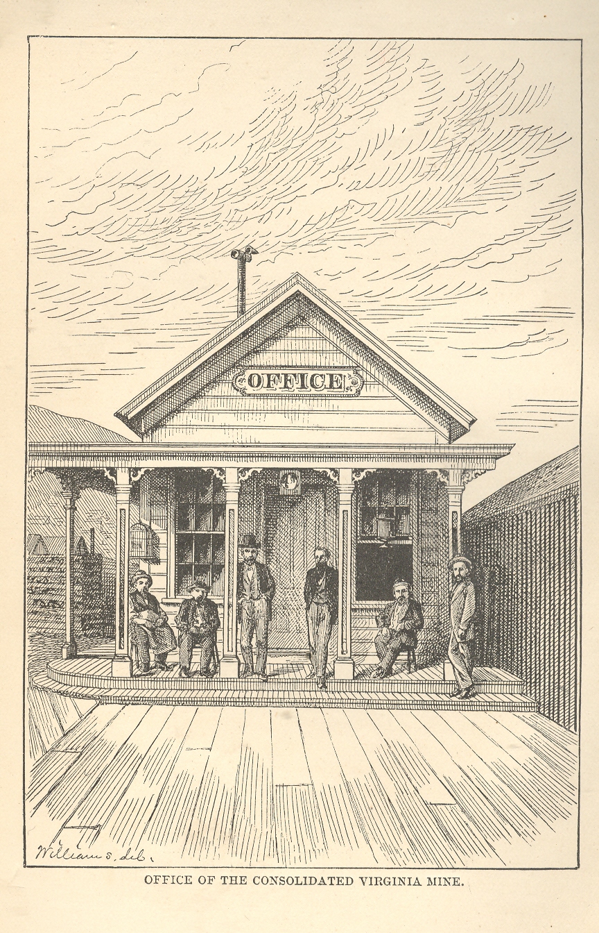
The image comes from William Wright's The History of the Big Bonanza and was published in 1877. It is a very simple scene (“Office of the Consolidated Virginia Mine”), nicely and proportionally arranged, though somewhat challenged by its understanding of linear perspective. For reasons I don’t quite understand it might as well have been a picture of the high desert with no settlement whatsoever. It simply seems still, and very quiet.
(3) Electrical Hum (and Ozone) Fishing Nets
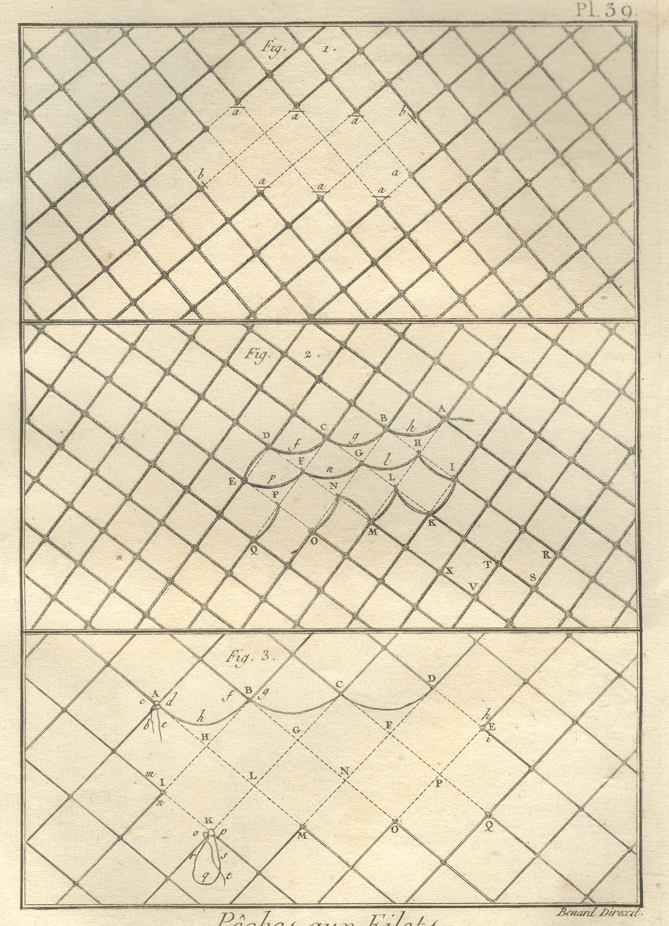
This image, from the quarto edition of the great Diderot and d'Alembert Encyclopedie (published over a number of years in the late 18th century), shows (I think) the ways to mend broken fishing nets. I have a definite sense of a high electrical hum from this, along with the added whiff of ozone. Its hardly something that was intended by the artist, but it was the first thing that registered with me when I bought this print 25 years ago.
Things
like this are available to us all of the time, simply waiting to be heard while
being seen.
Notes
1. After his death Mozart's estate was reckoned, and the contents of his house and belongings were catalogued. It was recorded that he had a very nice billiard table, and that he also had 12 cues. Now 12 cues might've been there because he liked the feel of the wood, or that he liked their artistic merit on the wall or in the corner. That, or he had a lot of people coming over to play. I like the later interpretation. Also, I cannot remember the reference for the ball/reflection story; please don't tell me that it is wrong.
|
JF Ptak Science Books LLC Post 921
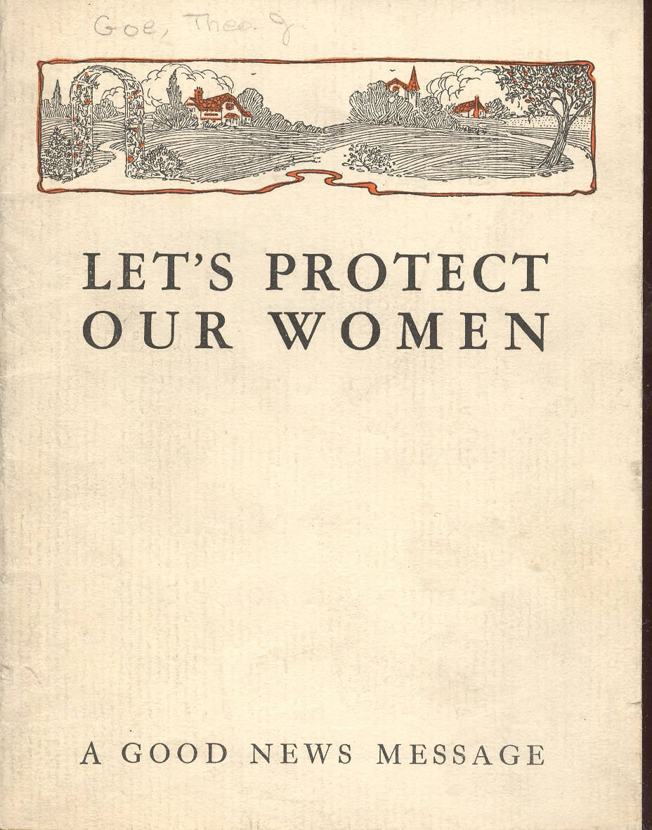
{This continues "The Coming Sex War of 1919")
Theodore J. Goe, the author of “Let’s Protect our Women”, must have been a synesthete, with the ability to smell the future. My copy of this pamphlet used to be the Copyright Deposit copy, and is dated January 18, 1936, and what Mr. Goe was smelling were the winds of the November presidential election; and since he was a Republican—or at least an anti-Rooseveltian—what he smelled was outrageous defeat for his cause.
 Women didn’t rush to aid FDR’s competition in the ’36 race,
when
Women didn’t rush to aid FDR’s competition in the ’36 race,
when
Landon was a decent man who had an interesting post-political career—even so, it’s a good thing that he lost.
|